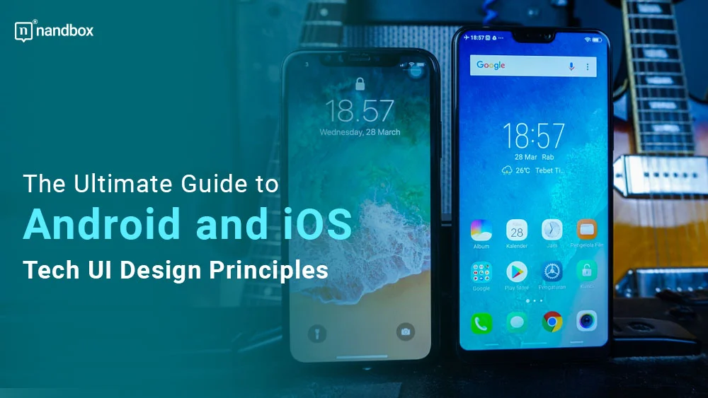
The app’s design is always a main factor in attracting users. You can’t deny that, as a user, whenever you come across a well-designed application, you instantly feel like this app is great, even if you haven’t gone through its functions yet. That is why designing an app takes up a huge portion of the whole app development process, where developers aim to create an organized and visually appealing design to improve the user experience. Android and iOS UI design principles shape how mobile apps look, feel, and function across both platforms. However, did you know that these designs must follow specific guidelines and that iOS and Android differed significantly, way more than you’d ever thought? This guide explains android and ios UI design principles, highlights the main differences between Apple and Android design guidelines, and shows why layout, navigation, typography, and controls matter so much in creating a better user experience.
What are iOS and Android Design Guidelines?
Back in the day, UI design wasn’t something that developers really focused on. Apps were really simple and mostly consisted of only one section or feature. However, day by day, as mobile models emerged, it was time to lay some groundwork for developers to follow. These guidelines have definitely evolved over time. For instance, the tech UI design guidelines for 2009’s Android, known as Cupcake, differ significantly from the current Android 13.0 in terms of scene size, buttons, etc.
On the other hand, Apple also had the same variations, and it went through many transformations over its lifetime. iOS application designs are all about minimalism; thus, the design modifications weren’t really visible to users until a huge modification turned the whole set of design guidelines upside down. This was when the biggest OS update, iOS 5, got released in 2014. This OS update changed many technical UI designs that developers usually followed in previous OS versions. This included modifications in app icon sizes, buttons, navigations, etc. Since then, Apple’s technical UI design guidelines, or human interface guidelines, as they are more commonly known, get slightly updated with each new OS update.
iOS Vs. Android UI Design: Four Key Differences
We all know the UI design of both iOS and Android is very visible and noticeable to all users. However, UI design is more of a complicated and technical process for developers, it even contains some aspects that you would never have thought of or noticed. Without further ado, let us demonstrate the main 5 differences between iOS and Android tech UI design
1. Units of Measurement

Firstly, both Android and iOS use different measurements when it comes to setting the base of the application’s tech UI design. iOS guidelines require developers and app designers to use and measure each element of the application in pixels or points, which are referred to as “px and pt.”
On the other hand, Android requires using and measuring all the app’s elements in density-independent pixels, mostly known as “dp.” These units of measurement are essential as they provide the base for many other guidelines, such as screen size.
2. Screen Size

One of the most obvious differences between iOS and Android app UI design is the screen size and resolution. iOS devices tend to have a consistent screen size and resolution, which comes in at 320 pt x 568 pt for the smallest iPhone device. While Android devices come in a wide range of sizes and resolutions, they come at 360 dpi x 640 dpi. That’s why it’s crucial that designers think about how their app will look and operate across an extensive list of screen sizes and specifications. Developers also need to think about how the application will alter when viewed in either landscape or portrait orientation.
3. Typography and Fonts
Typography and font choices are other key differences in iOS and Android app tech UI design. You may think it is the same at some points, but it is the complete opposite. The fonts used in iOS apps are typically more minimal and modern. Therefore, the human interface requirements mandated that a standard font called San Francisco be used consistently throughout all applications. The simple style that iOS aims for is reflected in this font’s design. Android apps, on the other hand, typically employ a bigger, more expressive font style. Thus, the material design also assigned a standard font for all applications and developers to use. This font is Roboto, which has a more bright and neat style.
4. Navigation Tabs
iOS is well-known for its sleek appearance and easy-to-use interface. The iOS navigation toolbar is always found on the bottom of the screen, and it is where a user can switch from one app’s section to another. Each section has a specific icon, which is also something included in the guidelines for the human interface. The section’s title may or may not be present with the icons. On the other hand, Android is more flexible when it comes to navigation toolbars. Developers can place the Android toolbar at the top or bottom of the screen; it is all up to them.
5. Control Design
Control design in tech UI design is any element that the user utilizes to take a specific action, such as primary call-to-action buttons, search functions, and action menus. For instance, on iOS devices, primary call-to-action buttons are always present in the upper-right corner of the application’s section. Whereas on Android devices, the call to action is always at the bottom right of the app’s section and takes the shape of a floating button. As for the search on both iOS and Android, the layout differs slightly. For example, to cancel a search on iOS’s technical UI design, you’d need to press the word cancel. However, on Android, you need to press the leftward arrow.
Final Thoughts
The tech UI design guidelines are the core and foundation of any app development process that developers should follow perfectly. Not only does it help in maintaining a consistent and appealing style across devices and operating systems, but it is also a great factor in accepting and publishing applications into either the Apple App Store or Google Play Store. However, following such guidelines very precisely is very time- and resource-consuming for all developers. But we’ve got the ultimate, effective solution.
In addition to being the only native no-code app builder on the market, nandbox also makes it very easy for developers to follow the precise tech UI design guidelines without exerting much effort. Owing to compiling both Android and iOS codes, nandbox can successfully develop applications that fit all of Google’s material design guidelines and Apple’s human interface design guidelines. This way, the developer can only focus on strengthening and enhancing his application with the great capabilities of the app builder while making sure that his app fits all the requirements. It seriously can’t get any better. Try the nandbox app builder now and enjoy the one-of-a-kind, effortless app development experience!