Your app icon is one of the most important parts of your app after the design, functionality, and name.
The design and functionality of your app—when successful—are what keep users coming back to your app. The name of your app is what helps users find it on the app store. But it is your app’s icon that makes your app instantly recognizable. Think about how you find an app you already have installed on your phone or even your computer.
Do you look for it by name or by app icon?
There’s more to designing an app icon than simply making it bold or using your company’s logo. Your app will join 2-3 million apps on the app store, and an average of 40 apps on user devices. It needs to stand out without being gaudy. And it also needs to be clear and recognizable in different sizes. The size of the icon at the design stage will be large, up to 1024×1024 pixels. But it is scaled down once displayed on the app store and installed on devices.
In this guide, we’ll take you through the dos and don’ts of designing a great app icon. Even when using a no-code app builder like nandbox to create your app, you still need an app icon.
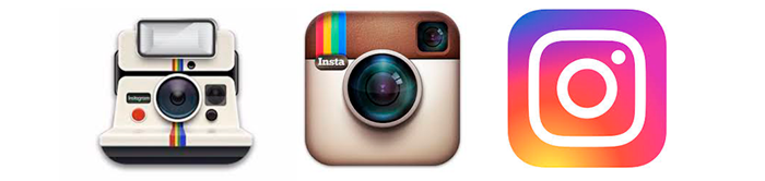
Know the Current Design Standards & Trends
Both Google and Apple provide extensive guidelines and advice on designing icons for either Android or iOS devices. Apple and Google do update their guidelines periodically, so you should monitor them for changes. Google also provides a simple icon design template for Illustrator. Apple provides icon design templates for Photoshop, Sketch, and Adobe XD.
It also helps to be aware of current design trends, especially in relation to app icons. Skeuomorphism, flat design, and material design are all recent design trends. Although they were primarily meant for user interface elements, they did also influence app icon designs.
Skeuomorphism did not scale easily, looked a little old-fashioned, and fell out of popularity around 2012. True flat design is no longer that popular. But it did influence many of the design elements you see now in websites, mobile apps, and Google’s Material Design.
While you don’t want to follow design trends too strictly, they should have some influence on your app icon design. Use sites like Freepik Icons, Iconfinder and Dribble to pick up on general and icon design trends. You can also browse the app charts on Google Play and the App Store. But don’t copy anything you see. If you see a design or style you like, contact the designer to see if they’re available for freelance work. Unless you have the skill to design an icon, you will need to hire a graphic designer at some point.
Keep it Simple
A key aspect of app icon design is simplicity. Your app icon is going to be shown in a variety of sizes and must be recognizable in all sizes. The detail that is clearly visible in a large icon could easily disappear when the icon is scaled down. And what looked great suddenly became a mess of color.
Check how the icon scales at every stage of the design process. This allows you to adjust the design or revise the concept before too much work has been done.
Play Around With Unusual Shapes and Symbols
This is not as easy as it sounds but can be essential. Especially if you are creating an app as an extension for your existing business and website. One of the most recognizable things about an established business or website is its logo. But logos don’t always translate well into app icons. They can be too large to fit into a square shape or have too much detail that doesn’t scale well. The best way to fix this is to find ways to adapt your logo without sacrificing brand identity.
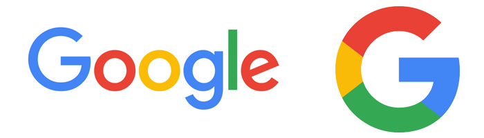
Look at both Amazon and Google. Their actual brand logo is instantly recognizable but would not scale well, especially when bound in a square.
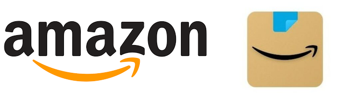
Unlike their earlier app icon, the new Amazon app icon doesn’t include any text. The primary color is reminiscent of a cardboard box, with a splash of blue like the tape Amazon uses. While they dropped the text, they did retain the A to Z “smile” from their logo. Their app icon does two things:
- It assures you that the app is for Amazon.
- It “tells” you what the app is for, i.e., shopping.
Google’s logo, which you see every time you open the main search page, is also instantly recognizable. But as with Amazon, it wouldn’t scale or fit neatly into a square. They overcame this by only using the distinct G and colors of their logo. This approach also made it possible for them to make their other apps easily recognizable. Most of their other app icons still use Google’s colors with symbols that are easily associated with the app’s function.
Shapes and symbols are also a great way to do what Amazon and Google do with their app icons. Suggesting what the app does is useful when your app is not for an established business. When users see your app icon in the app store, they can more easily see what the app does. Many design apps use paintbrushes, pens, and pencils in their app icons. And music apps favor records, parts of an instrument, or musical notes. However, it is easy to end up with an app icon that looks too similar to the icons of thousands of other apps. By playing around with different shapes and symbols, you can still suggest the app’s function while standing out.
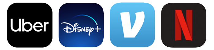
Avoid Using Text
Words do not scale well, which is why most app icons don’t include any text. There are a few outliers, such as Uber, HBO, Hulu, Disney+, and IMDb. But it helps that their brand names are short or distinctive, and the text appears on a solid color background. While you want users to associate your app with your brand, there are creative ways of achieving this. Facebook, Venmo, McDonald’s, Netflix, and Ticketmaster all use the first letter of their brand names, but in an iconic way.
Not using your brand name—or even the first letter of your brand—won’t make you less recognizable. On most devices, the app name appears below the app icon when installed.
Use Colors Strategically
One of the best ways to make your app stand out is through the clever use of color in the icon. Opt for bold, vibrant colors, but limit your palette to no more than four different colors. Too many colors can be distracting, and the design won’t scale well either. We recommend using colors people already associate with your brand. But if they’re too light, try using brighter shades of the same colors. You can encourage users to associate your colors with your brand by using them in the app itself.
Experiment with a plain colored symbol against a bold background, and vice versa. And look at what colors apps you will be competing with. Smartphone users like to customize their devices with different backgrounds or wallpapers. Test your app icon on a variety of wallpapers and images to see if it stands out or blends in.
Study Your Competitors
Don’t look to your competitors only to see what colors they use in their app icons. Look, too, at the overall design:
- Is it easy to tell what the app’s primary function is?
- If it is a well-known brand, do you immediately associate the app icon with the brand?
- What shapes or symbols have they used? Calendar, scheduling, and reminder apps frequently use a calendar-like symbol. Chat and messaging apps commonly feature a speech bubble. And camera apps almost always use a camera or lens.
It is a little wrong to using similar symbols if you make them somewhat different from how everyone else uses them. The icons below are all for heart rate and blood pressure tracking apps.

Although they all use a heart symbol, they have all found ways to make theirs different. They have also all used various shades of red in the design, a color associated with the heart and blood.
Make it Platform Independent
App icons for both iOS and Android must be PNG files. However, the size of the app icon differs between the two platforms. When submitting your app to Google Play, the app icon should measure 512px x 512px. For Apple’s App Store, the icon should measure 1024px x 1024px.
Both platforms will scale the icon appropriately for different devices and spaces. Google also dynamically applies a rounded mask and shadow. If you are using nandbox to create your mobile app, your app icon should measure 1024px x 1024px for both platforms.
Using the same app icon on Android and iOS means your app is easily recognizable regardless of the device. Someone switching from one platform to another will still be able to find your app without difficulty.
Test Different Designs
Your first design is unlikely to be perfect. And aside from that, your interpretation of a concept and design elements could be very different from that of your average user. Avoid ending up with an app icon that doesn’t resonate with your target audience by testing two or more designs. Services such as UsabilityHub’s Five Second Test, UXtweak, and PickFu can help with user testing that doesn’t cost a fortune. If you’ve ever done A/B testing on landing pages, your website, or your email newsletter, you are already familiar with the concept.
Refresh Your App Icon
There shouldn’t be a need for you to refresh or redesign your app icon too frequently. However, over the last decade, we have seen a switch from skeuomorphic design to flat and then material design.
Depending on how dramatically app icon design trends shift, not updating your app icon can make it look dated. And a dated app icon can result in users thinking your app is also outdated.
With nandbox, you can easily create your own mobile app with no previous coding experience. But reading and understanding the points covered in this article won’t turn you into the world’s greatest app icon designer. Not unless you already have extensive graphic design experience.
So, don’t hesitate to outsource the design of your app icon to a professional designer. And with the knowledge gained from this article, you’ll have a better idea of what to look for. You’ll also have a better understanding of the designer’s approach, and how you can provide input or suggestions.
Fiverr, Upwork, and 99designs are great platforms for finding talented designers. Just take time to browse their portfolios, focusing on their app icon work.