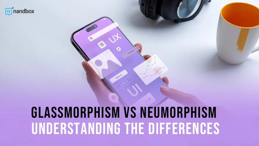
Neumorphism vs Glassmorphism: UI Designs You Should Know About
UI design is a major and fundamental part of any website or application. Thus, it is no surprise that the UI design world is very dynamic, providing UI designers with new trends and practices each and every day. Recently, there has been an obsession with particular UI designs and styles that are taking over the world. These two trends flourished due to the fact that they captured the modern and futuristic atmosphere and vibe that we are currently witnessing in all industries. The UI designs we are going to discuss are glassmorphism and neumorphism. In this article, we will dive deep into the two UI trends and explore all their key characteristics. Also, we will conduct a glassmorphism vs. neumorphism comparison to establish the key differences.
What is Neumorphism?
Neumorphism comes from the word new skeuomorphism, which is another common UI design style. I know, too much -ism is not a good sign. However, later on, you will find that they are very simple terms. Both designs have the same concept, which is to represent or imitate real-life concepts and elements. Skeuomorphism was the default direction for most websites and applications for many years. Until people decided that it was time for a new and modern change, and this is where neumorphism appeared. Neumorphism’s direction is much more subtle and uncomplicated. As it aims to show elements in a realistic way while keeping them simple at the same time. When implementing neumorphism, you have to focus on one thing: being as minimal as possible, while also attracting users.
Characteristics of Neumorphism
There are always key characteristics for any UI design, each varies depending on the type and direction of the design. However, in this article, we choose three main elements in each design to discuss: colors, visuals, and menus. So let us start with neumorphism.
Colors
When it comes to colors in neumorphism, they are as simple as they can get. The color palette chosen for the applications and websites usually contains earthy and minimal colors. They vary from whites, greys, beiges, and so on. The colors in neumorphism are expressed significantly in the background color, for instance. The background in this case has to match up with all the menu and button colors. This is to create a sense of uniformity and softness. These soft tones provide a gentle contrast with the elements on the screen and contribute to the overall soft and ambient feel of the design. The base color is used for the primary elements of the interface, such as cards, buttons, and input fields. Neumorphism design typically employs muted or desaturated colors. Shades of gray, beige, or light pastels are commonly used to create a sense of depth and subtlety.
Visuals
As per the visuals, they are kept on the flat and simple side. All the elements included in either websites or applications using neumorphism usually have depth. This is usually done through the excessive use of shadow and depth effects, which give users the feeling that the elements are real.
To ensure accessibility, designers using the neumorphism design frequently employ a high level of contrast between the background and main elements. This is accomplished through the detailed and careful choice of colors and placement of all elements.
Menus and Buttons
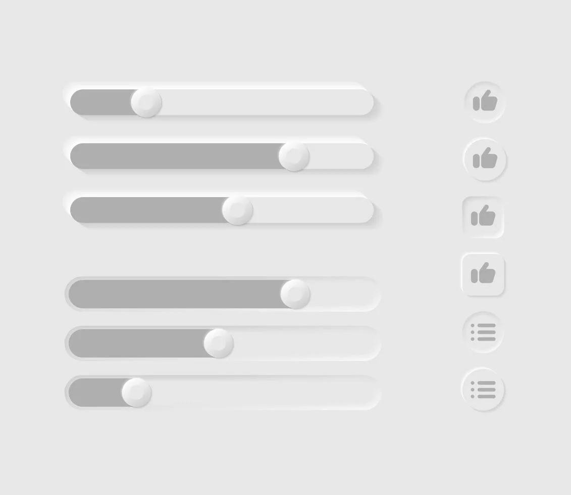
The menus and buttons in the neumorphism are greatly influenced by the visuals applied throughout the whole design. All the buttons have a flat design with shadow visuals. This creates a floating effect for all the buttons. Thus appearing as if they are above the screen level, which accomplishes the main purpose of neumorphism which is imitating real life. Buttons are also characterized by soft edges that make them look more appealing and intuitive. As per menus, they also have depth and shadow effects, as well as gradients and soft colors that usually match the background.
What is Glassmorphism?
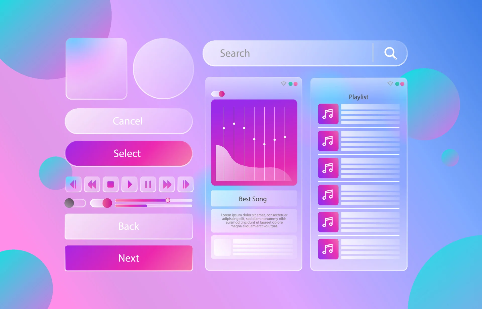
Now that we are done with neumorphism, let us start with another -ism on the list that literally took me a lot to pronounce. Glassmorphism is exactly what the name implies, glassy. This design has gained much attention in recent years. This is maybe due to the fact that one of the major tech giants deployed this design in their operating systems. Apple is considered to be the real start for glassmorphism to shine in the UI world and get this much recognition. As it made quite an appearance in the MacOS update back in 2013. Since then, it has been a part of the regular UI design for Apple. Many other enormous brands like Microsoft also applied the same UI design. What made glassmorphism special is that gives apps and operating systems this transparent and neat look that helps improve the user experience to a great extent.
Characteristics of Glassmorphism
Just like we did with neumorphism, we are going to explore the key elements and characteristics of the main elements in glassmorphism UI design.
Colors
The colors in glassmorphism are much different than in neumorphism. The only similarity is that we are still with the soft tones and colors. However, in this case, we are not limited to earthy tones. In glassmorphism, the color palette contains light tones and pastel colors, like blues, greens, yellows, and purples. Also to accomplish the transparent look that is the main purpose of this UI design, the colors used are translucent to give the look and feel of clarity. As per the background, we are not talking about uniformity like in neumorphism, in glassmorphism the backgrounds take a more blurred path. This is to give a glass-like effect.
Visuals
The visuals in glassmorphism are also pretty simple. For instance, the translucent and blurred effect is the core and most visual used in this UI design used. It is utilized for backgrounds and elements like menus, bars, and buttons. In glassmorphism, the shadow effect also makes a light appearance by applying soft shadows for all elements to enhance the overall aesthetic. The modern and futuristic appearance of glassmorphism is usually accomplished through the visual, which is why they are an integral part.
Menus and Buttons
The menus and buttons are kind of on the same page in glassmorphism and neumorphism. The buttons also feature rounded corners ad so edges that improve usability and visibility. The typeface is also very simple and avoids any complexity. As per the menus, they also match the transparent path of everything else in the glassmorphism UI design.
Glassmorphism vs Neumorphism: Key Difference
Now that we have explored the key characteristics of neumorphism and glassmorphism, let’s take a closer look at how glassmorphism vs neumorphism compare to each other. Both neumorphism and glassmorphism aim to create visually appealing and modern interfaces, but they achieve this in different ways.
Neumorphism is a design style that emphasizes depth and realism through the use of soft shadows and gradients. It’s designed to feel and function like real-world things and textures. Glassmorphism, on the other hand, emphasizes see-through materials and patterns that evoke frosted glass to create a modern and clean appearance. By using transparency and blurring, it gives the illusion of depth and reveals the content behind the UI elements.
The degree of complexity is another key distinction between neumorphism and glassmorphism. Neumorphism style typically employs a cleaner aesthetic, favoring bright whites and soft grays. It’s designed to be more user-friendly and straightforward. In contrast, glassmorphism’s visual complexity might increase thanks to its translucent components and hazy backgrounds. The result is an interface that is more appealing to the eye.
Both neumorphism and glassmorphism have challenges with accessibility. Users with visual impairments may have trouble distinguishing between UI elements in designs that employ neumorphism due to its use of subtle shadows and gradients. Readability can be hindered by poorly crafted transparent parts in glassmorphism. To create a welcoming environment for users of both approaches, designers must pay close attention to contrast and visibility and ensure and unique and seamless user experience.
Examples of Neumorphism and Glassmorphism in Real-World Applications
To better understand the practical implementation of neumorphism and glassmorphism, let’s take a look at some real-world examples. These examples will showcase how these design trends can be applied to different types of interfaces and industries.
Neumorphism:
- Banking App: A banking app might use neumorphism to create a clean and modern interface that instills trust and reliability. The soft shadows and gradients can give the UI elements a tactile feel, mimicking the look and feel of physical bank cards and buttons.
- E-commerce App: An e-commerce app might incorporate neumorphism to create a visually appealing and user-friendly shopping experience. The subtle shadows and gradients can make the product images and buttons stand out, enhancing the overall aesthetic.
Glassmorphism:
- Music Streaming App: A music streaming app might utilize glassmorphism to create a sleek and futuristic interface. The transparent and frosted glass-like elements can give the app a modern and sophisticated look, enhancing the user’s overall listening experience.
- Travel Booking App: A travel booking app might adopt glassmorphism to create a visually striking interface that reflects the excitement of traveling. The blurred background and translucent elements can create a sense of depth and elegance, enticing users to explore different travel options. These examples demonstrate the versatility of neumorphism and glassmorphism and how can designers tailor them to suit different industries and design goals.
Final Thoughts
To this end, both approaches capture the modern and innovative side of the world that we are currently working with perfectly. The UI design world is now over with the extravagant way of doing things that were prevalent back in the day. We are now ready for a more modern look. Thus we can declare no winner in the glassmorphism vs neumorphism comparison. Both approaches are great to apply. However, it is important to take into consideration all the drawbacks that might result from each and see which one would be suitable for your requirements and needs.