Creating a mobile app is a bit like planning a first date: presentation is key, and first impressions linger. But while you can’t ensure your date arrives in a shining suit or a dazzling dress, you do have full control over how your app dresses to impress.
After all, in a world where we judge books by their covers and apps by their interfaces, the earliest screens of your mobile application are critical canvases for user attraction.
From the erratically churning seas of apps, how do you fashion yours into the lighthouse that beckons users through the foggy nights of digital tides?
The answer is not merely in a spectacular affair of graphics and colors, but a symphony of intuitive design and user-centric beauty. We’re about to unveil the 7 visual elements that will turn your app’s first impression into a lasting impact. It’s time to swipe right on interface finesse!
The Critical Role of Visual Elements in Mobile Apps
Gone are the days when an app’s functionality alone sealed the deal. The battlefield has expanded – into the realm of aesthetics.
If your app’s design navigation is akin to a hedge maze, or the fonts are overly big and misplaced, the users won’t last long. In today’s attention-deficient digital environment, where apps are as disposable as razor blades, a subpar design means a swift bid adieu.
But you already know design is crucial – it’s the priority stakeholder in all reputable app projects. Now, it’s time to unpack the visual components that transform a mere home screen into a habitat that users will return to, day after day.
These aren’t just aesthetics; they’re the persuasive tongues of a charming conversationalist. They are the visual love languages that flatter, cajole, and engage if spoken in unison.
How Early Screen Designs Influence User Retention and Engagement
Think back to your worst-designed app encounter. Was it an Etsy clone that looked like it was dipped in the technicolor fanny pack of the ’90s or a FinTech app with hieroglyphics for icons? We dreary-eyed humans forget life’s mundanities, but we never forget a bad design. Each glance at an interface is a moment ripe with silent judgment and decision-theater in our minds.
Every pixel is a choice, and how we lay our interface’s foundation determines not just the shape of user interactions but the depth of engagement. That’s why the visual elements we’ll dissect aren’t just for window-dressing; they’re the blueprints for a beautiful and purposeful UX.
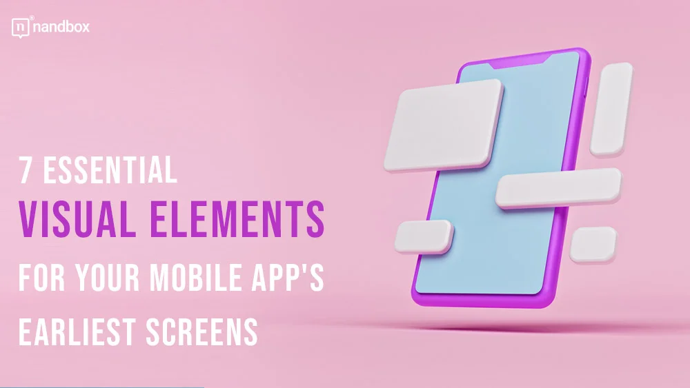
7 Essential Visual Elements That Enhance the User Experience in the Initial Stages of App Use
Can you remember the opening scene of your favorite movie? That’s the magic we aim for in the first interaction with your app. Here are the seven-screen elements that need to sing in harmony to create an app user’s love-at-first-sight moment.
1. Intuitive Navigation Icons
Like the signposts on a highway, navigation icons guide users through your app’s landscape. But here’s the tricky part – they must do so without anyone consciously acknowledging their existence. It’s akin to being a master illusionist; the trick is to look effortless.
Consider using custom icons that reflect your brand’s personality while maintaining universality. The humble ‘hamburger menu’ or ‘three-dot’ ellipsis can be an artist’s brush – the user’s canvas is waiting for a masterpiece.
2. Impactful Splash Screens
A splash screen is your app’s “How do you do?” to the world. It’s that charismatic handshake that starts the conversation.
In an ideal scenario, your splash screen should be an eloquent introduction to your app, not the digital equivalent of an awkward social leftover emoji. Make it seamless, make it brief, but most importantly, make it memorable.
3. Engaging Onboarding Screens
Onboarding screens are your app’s narrator.
They’re there to teach, inspire, and reassure – like a tutorial, roadmap, and an encouraging pat on the back all rolled into one. Use this space wisely. Each screen should tell a piece of the app’s story while encouraging users to tap, swipe, and commit to exploring further.
4. Attractive, Customizable Banners
Attractive, customizable banners are the billboards of your app’s universe – they capture attention, convey key messages, and provide users with a sense of relevance.
These banners should be visually compelling and flexible enough to adapt to various content and user preferences. Think of them as the stylish yet informative hats your app wears. By allowing users to customize banners, you’re giving them control and a sense of ownership over their experience, making your app feel more like their own digital haven.
High-quality, eye-catching banners can drive engagement and enhance user satisfaction, ensuring they stay longer and explore more. For inspiration and a plethora of design ideas, check out the amazing collection of customizable online banner designs at Picsart.
5. Clear and Readable Typography
The text is the unsung hero of an app’s design.
It’s the workhorse of your app, conveying messages, guiding actions, and helping users make sense of the digital chaos vying for their attention. The font selection, size, and color play a significant role in making this workhorse effective. A balanced combination of aesthetics and legibility is a must; remember, legibility is likeability in the text world.
6. Consistent Color Schemes
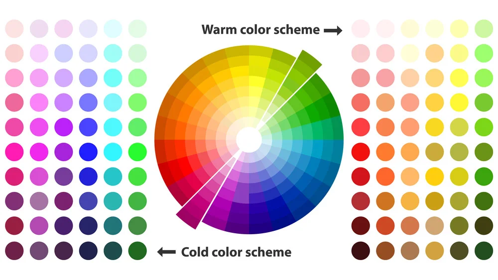
Are you using colors thoughtfully, or are you just throwing every shade in the box onto the canvas? Consistency in color schemes across your app’s different sections builds visual harmony, familiarity, and brand recognition. It’s the difference between a Monet and a kindergarten finger-painting – both can be colorful, but only one is art.
7. Interactive and Informative Tooltips

When used correctly, tooltips are like a magician revealing the secret to a card trick—they’re informative and crucial, and nothing quite makes sense without it.
Tooltips should be a user’s companion, subtly guiding without being overbearing. Think of it as the wise sidekick to a hero in a blockbuster adventure.
Conclusion
In the end, creating an engaging app is like crafting a fine dish; it requires the perfect balance of all elements to delight the user.
From elegant typography to consistent color schemes, every detail matters. Embrace interactive tooltips and mindful banners, ensuring they serve more than just their basic function. Keep it thoughtful but not overbearing, aesthetic yet practical. By doing so, you transform your app from just another tool to a cherished digital companion.