You don’t need the statistics to back up the fact that people use mobile phones extensively today, even more than laptops. The demand for mobile-ready platforms is higher than ever. And as a web design company or a designer, part of your job is to know how to make a website work optimally on all devices. There are specific practices that will help you achieve the best results when creating a responsive design. This article will help, offering tips on designing a responsive app for mobile devices concerning UI.
First, let’s introduce you to responsive apps.
What is a Responsive App?
Some mobile apps, like TikTok and mobile games, work on mobile phones specifically. An app like TikTok works better in portrait mode than landscape mode because it was designed for portrait viewing.
Similarly, some websites are designed for browsing on a PC only and wouldn’t function well on a mobile device.
These aren’t responsive apps. But take a website like Dropbox; it works the same in both orientations and looks and feels great on all devices of all sizes; this is a responsive web app.
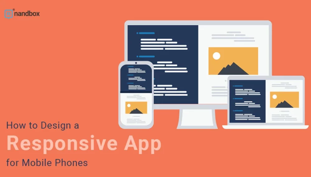
A responsive app is a website designed to look and function almost the same on all devices, from laptops (or PCs) to handheld devices like tablets and mobile apps.
Best Responsive App UI Design Practices

A responsive app design relies on both UI and UX aspects. This article focuses more on UI. Here are some tips to help you design a responsive web app.
The Design Should Be Flexible and Fluid

Flexibility is important when creating a responsive app. If elements like images, text blocks, layouts, and media aren’t fluid, you will face problems when you try to resize, reposition, and reflow them in any way. They won’t look like they fit the overall design.
If you have enough room in your HTML container, you should render your images at their native dimension. A fixed width might stand in the way of scaling the image, so the solution is to write max-width when assigning the width value.
Cropping the image may be necessary for smaller screens but be careful not to affect its impact. Another tip is to use vector graphics instead of raster graphics, so images look the same at any size. It’s worth it to explore vector images when creating your responsive app. They retain their quality no matter the scale, making your design visually consistent on any screen size.
Use the Breakpoint System
A breakpoint system classifies different screen sizes by specifying points where the UI will change depending on the width. Breakpoints are the point of transition from one screen size to another. Although there are no specific rules for the breakpoint system, you should divide them into at least four categories, a laptop, a large tablet, a small tablet, and a mobile phone. Use these breakpoints to dictate how the app will look at each screen size.
Choose Typography Wisely
Typography plays a critical role in responsive web design. Choosing the right font family and sizing it right can make all the difference. The text has to be scalable by being accessible. The accessible text is clear and legible, even on smaller devices. And there should be enough contrast between the color of the text and the background.
Remember that text in its real form is more practical and faster to upload than in image form. Not to mention that it’s more accessible as it can be read using text to speech, unlike text in image form. And it can be enlarged for users with low vision.
Start with the Smaller Screens

When working on designing a smaller screen, you learn to prioritize functions and elements to fit it. That’s why you should start with smaller devices before moving on to larger sizes.
Choose The Suitable Design Patterns
There are five primary multi-device designs, according to Google’s Luke Wroblewski. These patterns guide responsive design using fluid grids and media query adjustments.
- The first is the mostly fluid pattern, a multi-column layout where larger screens have larger margins. It relies on the fluid grid, and the columns are stacked vertically. With this pattern, the app’s layout doesn’t change unless the screen is tiny.
- Another multi-column pattern is column drop. With this pattern, the columns drop along the way, hence the name, as the screen gets narrower. The layout changes with different screen sizes, but the elements stay the same.
- The layout shifter pattern requires much more work than other patterns, as it’s the most adaptive one, with changes on each screen size.
- The opposite applies to the tiny tweaks pattern. It’s the simplest, where only minor changes happen to the layout. Very few apps make use of that pattern.
- Off-Canvas is the final pattern option. The design hides some functions on the left margin in a hamburger-like menu, so users can only access them— on a smaller screen. This makes it fundamentally different from other patterns where the columns fall vertically.
Responsive Websites VS. Native Apps
While responsive websites provide accessibility for mobile users, they aren’t as powerful as native mobile apps. That’s because native apps take full advantage of the mobile device’s functionality with features like GPS, cameras, scanning, and others. Moreover, mobile apps are more accessible and available, as they work offline, unlike websites.
Another thing that gives native apps an advantage is they can offer users a more personalized experience because the app can easily store the user’s information and use it to craft a unique experience.
Designing a native app gives you much more freedom to create a complex UI than a website because HTML5 can only do so much when it comes to design complexity. And if you’re looking to monetize your app, you can do it better with native apps by setting up a store, in-app purchases, or ads. A store, for example, is much easier for users to navigate with an app than a website. Overall, a native provides a much better experience for users than a responsive app.
The only disadvantage of native apps is that they cost a lot to develop because the app gets programmed to operate on a specific operating system, like iOS or Android. If you’re wondering how to build a native app without spending thousands of dollars, the answer is the nandbox native no-code app builder. It has all the features you need to craft a beautiful modern-looking fully operational app in minutes.