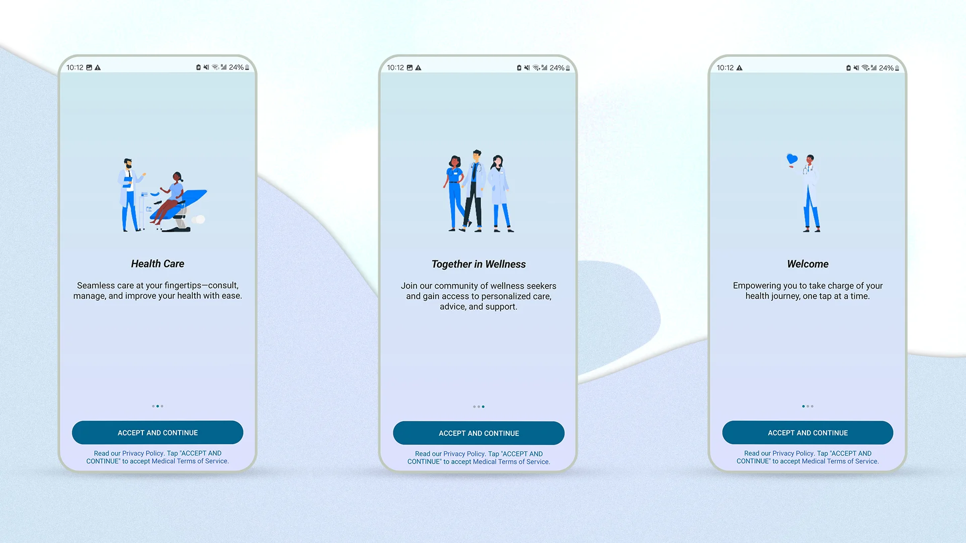
With billions of users worldwide, we live in an app-centric world. For that reason, millions of apps are available for download on the App Store and Google Play Store. You may wonder how your app can stand out among the enormous crowd. A good marketing strategy drives users to use your app, but what can get them to keep the app downloaded instead of deleting it? The first impression lasts, and a useful, well-designed splash screen can make an excellent one. Read on to learn more about why you need a splash screen for your mobile application. Then, observe these app splash screen examples for inspiration and learn how to make yours using the nandbox app builder.
Why Your App Needs a Splash Screen
The splash screen is the first thing a user encounters after downloading an app. Evidently, the brand logo and name are displayed on the first splash screen to establish brand identity and perception. You should remember to create a minimalist logo and catchy name for the best first impression. It sets the tone as well, showing the users what to expect when using the app. Some apps include more than one app splash screen to introduce app features and functions. Initially, Apple created the splash screen for iOS apps to keep users occupied while the app is loading. Because no one likes to wait, the splash screen can prevent users from giving up on the app early on.
App Splash Screen Examples
#1: YouTube
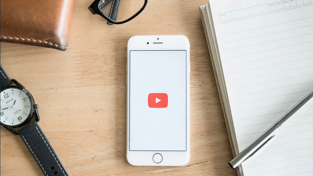
YouTube keeps it plain and simple with its splash screen design. The background is white, leaving the red logo as the screen’s centerpiece. As you can see, the logo is vibrant enough to stand out on its own.
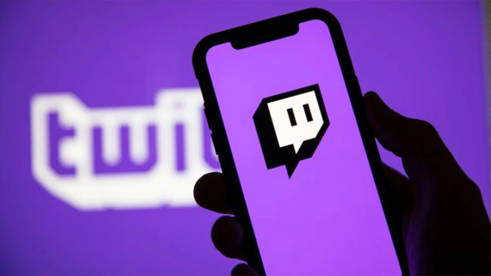
#2: Twitch
The video live-streaming platform uses a different approach than its counterpart. The background utilizes the brand color of bright purple, while the logo is white.
#3: Spotify and Netflix
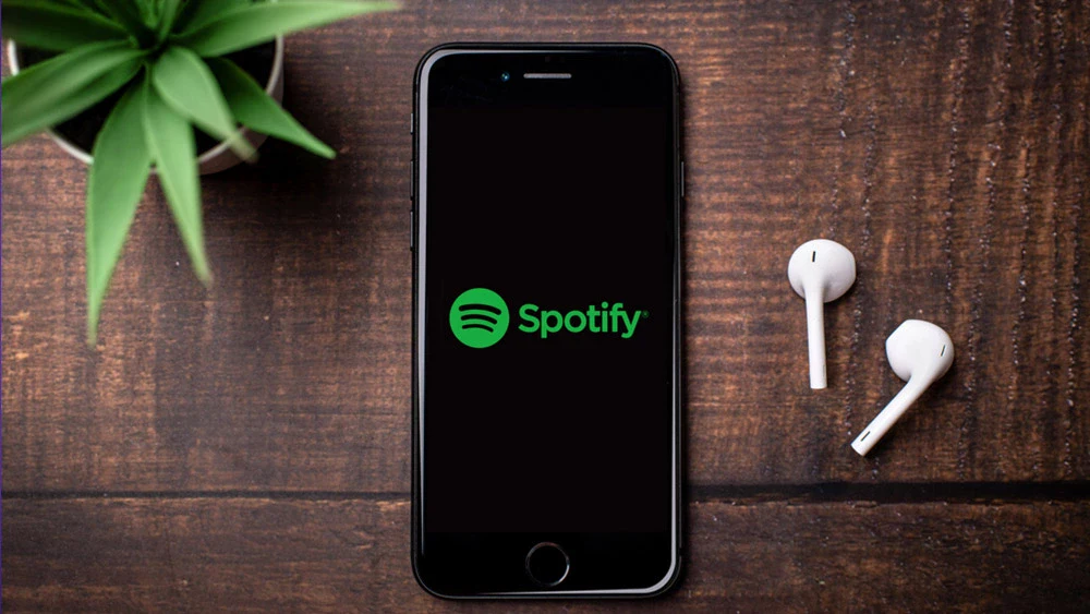
We decided to include both Spotify and Netflix under one section for obvious reasons. Both have a black background that contrasts with their logos. Not only does it create a dramatic effect, but it also matches the color of the apps’ interfaces.
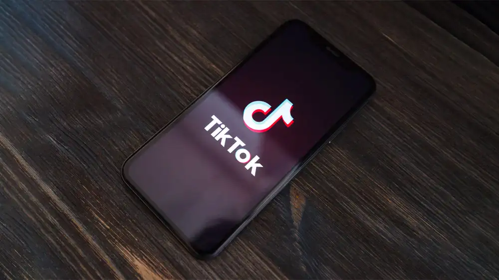
#4: TikTok
In a similar fashion, TikTok opted for a black background. Although the app’s splash screen might not seem very different from Spotify and Netflix’s, the gradient colors in its logo make it more unique.
#5: nandbox Messenger
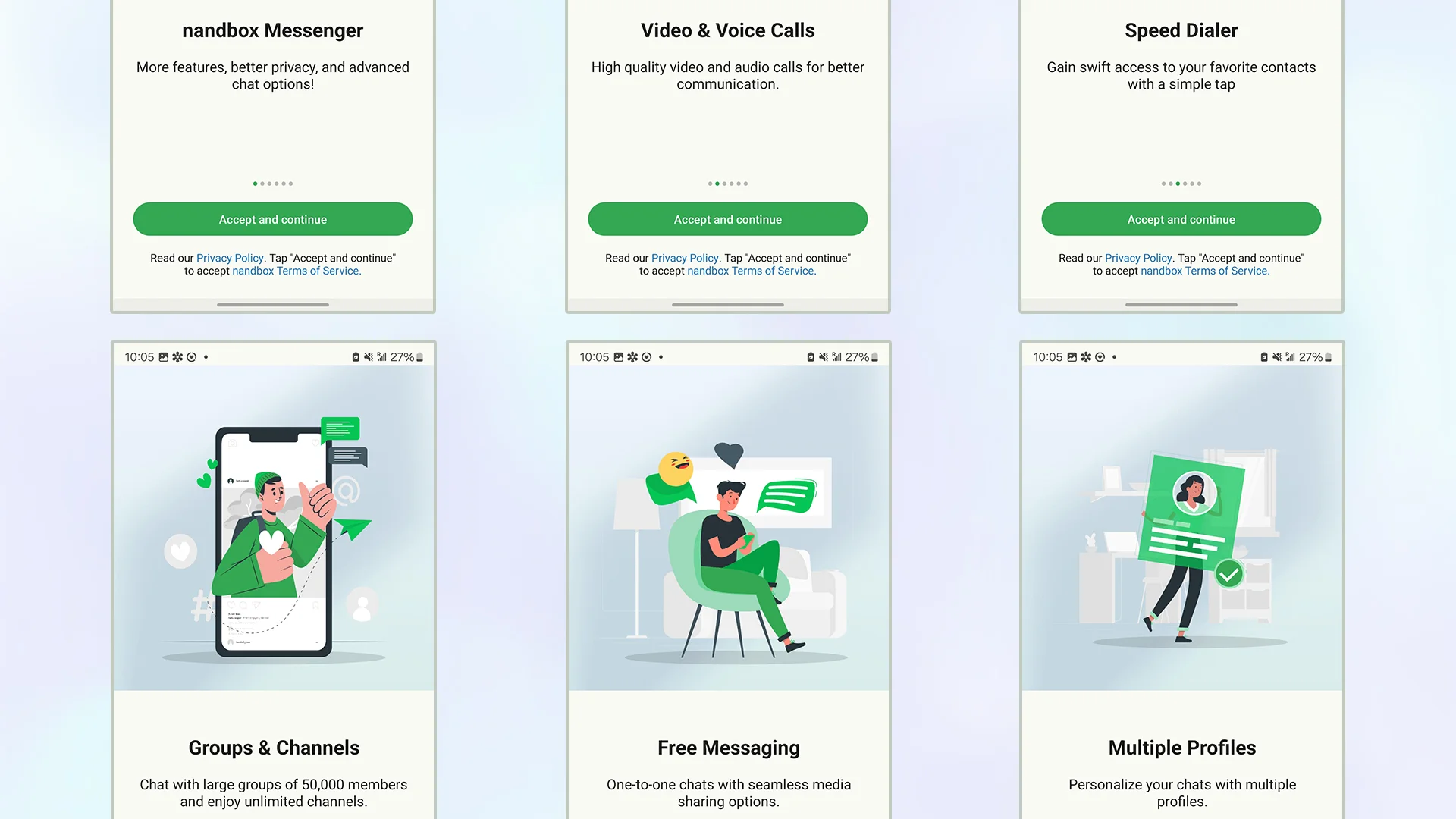
nandbox Messenger starts with several splash screens when you install the app. Both the background and logo share a similar vivid green. Each splash screen contains the features included in the app, like free messaging and multiple profiles.
How to Create a Splash Screen with the nandbox App Builder
We’ve provided some app splash screen examples and demonstrated the different approaches that popular brands use. So now, we can tell you more about making your own splash screen using the nandbox app builder. Sign up now to try this feature.
To create and customize a splash screen for your app, head to the app settings menu in the nandbox app builder. There, you can add several splash screens to display the essential features of your app. Once you pick the background color and upload your brand logo as an icon, both will appear on the preview screen. Through the preview screen, you can see how the splash screen looks on both an Android and iOS device. Then, you can add the start button text, title text, and description or slogan. Using the nandbox app builder, you can create a welcoming splash screen that makes a powerful first impression and raises brand awareness.
