User interface (UI) and user experience (UX) are two vital concepts in any app development process. The user interface, or UI, is the visual part of any app. It forms the whole look and feel of an app. On the other hand, the user experience, or UX, is how the user interacts, navigates, and functions with the app. We can’t state that it is the core of the process. However, the presence of a great UI and UX differ significantly in determining whether this app can succeed or not. Designing the UI and UX is a very complicated process. It requires a thorough knowledge of programming languages like Python and JavaScript. The growth state of the mobile app market is not slowing down or ending anytime soon. That is exactly what drove Google, the renowned company with the largest app store, to step in and launch a user interface and experience language that is easy and streamlined. In this article, we will demonstrate everything about this design language known as “Google Material Design.”
The Foundation of Material Design: How Did It Start?
The year is 2014. The earth is revolving, we have great music, and Gwen Stacy slipped through Peter Parker’s fingers, literally. Good times, good times. Diving deep into the not-so-mainstream and important side (as important as Gwen Stacy). Around this time, the demand for apps was only going up, it was really the flourishing era for apps. With the increasing demand, developers were in a really tough spot, which was to fulfill these needs and demands. Since Android devices and operating systems were achieving exceptional success at the time, the demand for Android apps was much greater. That is when Google thought about an innovative way to make the development process easy and simple for developers. They successfully launched material design.
Material Design is a design language, or, as other people may describe it, the largest library of Google’s design guidelines. It also includes components, and everything a developer would need to create an intuitive and appealing UI. Throughout the years, material design has been a great aid to developers around the world. It was always updated with every new Android OS and guidelines to make sure developers never missed a thing. Among many components and resources, material design has some key elements that are essential for developers.
Key Elements of Google’s Material Design
Motion and Transitions
Google’s Material Design places a strong emphasis on motion and transitions. By guiding users through different methods and transitions, it contributes to an intuitive and seamless interface. It’s essential that you keep the transitions in your app simple, clear, and effective while designing them. You can employ transitions to smooth the user’s transition between screens or sections and to illustrate the link between the app’s features and elements. Also, make sure to test motions, animations, and transitions thoroughly and make sure that they function efficiently on all types of devices, screens, and operating systems.
Typography
Google’s Material Design places equal emphasis on motion and transitions, typography, and color. It’s crucial to think about readability, structure, and cleanliness while selecting a font for your app. In the end, it is important that the user understand all the components included in the app. Keep the number of variations and fonts you use across the app small to make everything look minimal and put-together. Also, make sure your fonts are easy to read and understand and usable across a variety of devices and operating systems. Since the standardized font for all Android devices is Roboto. The material design includes all the guidelines, such as scale, size, spacing units, and variations of the robot font, that developers could use. Additionally, it includes the complete resource library, including all the codes necessary.
Icons
Icons are probably the most important elements in Google’s material design. They help communicate information about particular sections and features in the app quickly and effectively. They also give a bold and great look to the app and enhance the user experience. The more minimal and bold the icons are, the more likely users are to be satisfied. That is why Google encourages the use of simple, bold icons that are easy to recognize and understand. Keep in mind that icons should be high-quality and relevant to the content to avoid user frustration. Google Material Design provides developers with a large library of icons in all categories. Another website that is worth checking is Flaticon, which also offers a huge library of icons for developers. Such as social, communication, business, and payment icons. Developers can customize icons in terms of weight, size, and grade. Once they customized the icons to their liking, they could copy and get the icons’ codes.
Buttons
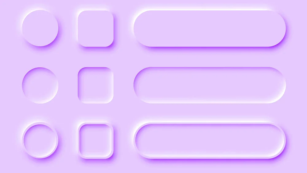
Buttons are something major that can’t, by any chance, be disregarded. They are an essential element of any website or app design. In Google’s Material Design, buttons come in many shapes, forms, and functions, such as elevated buttons, text buttons, floating action buttons, and many more. They are designed to be simple, clear, and easy to use. The design and implementation process for buttons is not necessarily easy; it can be quite difficult. To implement a button in an app, developers need to specify many things, such as color, state, layout, and configuration. Where each differs significantly from one button type to another. Since Google Material Design came in the hope of making this process easier for developers, it has all the guidelines and resources for designing and implementing that a developer would need.
Navigation
Any developer and app designer cannot neglect the significance of navigation and menus. Google Material Design emphasizes simplicity and accessibility. Thus, navigation menus must be clearly presented and organized. Material design is considered very limited when it comes to navigation. Although it is one of the most important elements, it doesn’t provide developers and app designers with many options. It only includes one option for navigation menus, which is bottom bar navigation. You usually find it in many apps and developers commonly use it. Material design also includes all the resources, specs, and guidelines for the navigation menu that developers would need.
Layouts
Material Design relies primarily on app layouts to help organize content and app sections and direct the user through a clear and well-structured interface. In order to maintain a visually appealing structure, Material Design proposes the use of different layouts to fit different devices. Material design also divides the layout into six different elements to make it easier for developers to understand the whole app and web layout structures. These six elements are column, fold, margin, pane, spacer, and window. It explains everything about the layout and the whole design and engineering process. Google Material Design also provides developers with all the updates on new devices and operating systems and the codes they would need.
Drawbacks of Google Material Design
Lack of flexibility
Google’s material design is not flexible when it comes to interfaces; it is mainly based on traditional user interfaces. This made developers unsatisfied, as now we can see more advanced and high-standard interfaces that employ new and emerging technologies like augmented reality. However, We can expect that Google may step up to include such complex structures and adapt to new technologies.
Limited customization
Material Design is established upon a set of standards, guidelines, and elements that aim to standardize the look and feel of apps made through it. While this can help create universal visual and design standards, it also might limit developers’ and designers’ flexibility to make their apps’ designs look and feel truly their own and reflect their vision. As we previously mentioned, Google Materials restricts developers to one navigation pattern and menu, which also adds to this drawback and confirms the lack of flexibility in this platform.
Absence of platform specificity
When first established, Google Materials Design only focused on the guidelines, resources, and tools for Android devices. However, with time and after the demand for more devices and operating systems to be included, they included iOS and Web in their platform. As much as this can be greatly beneficial, it also leads to a major lack of specialty. As Google’s first specialty is Android, you’d expect that its material design only specializes in offering resources for developing Android apps. However, many see that the inclusion of other operating systems makes material design lose its place, specialty, and powerful capability for developing and designing Android apps.
Final Thoughts
We can consider Google Material Design to be a breakthrough and an exceptional platform for developers. However, it also has its pitfalls. Yet, we can’t ignore how it is such a beneficial reference for developers now and helps them save time and effort while designing UI. Another thing that we must mention about Material Design is that it focuses mainly on developers with great coding experience and professionals. This means that people with minimal knowledge or no coding knowledge at all can’t use google material Design, as it would be a tad difficult to work with. However, a solution is always there.
If you are someone who is interested in app development or UI design, you can always go to no-code development platforms like nandbox. These platforms allow everyone, literally, to develop high-functioning apps and design interfaces in no time. In addition to saving time, they also save money, For instance, you will develop a great native app with your own customized branding and interface with prices that start at only $49! So, what are you waiting for? Swing into action and try the nandbox app builder now!
