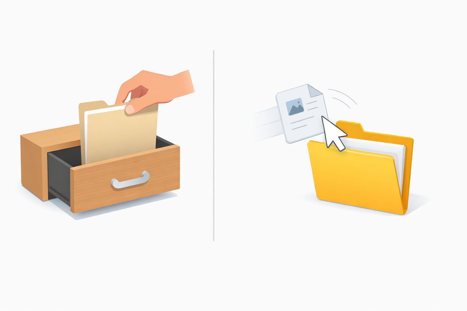
We perform one digital action constantly without thinking, whether moving a phone app or reordering a favorite playlist. This invisible shortcut is an effortless app creation of drag-and-drop ui, making technology feel like a natural extension of your hand. In practice, moving a digital file mimics reality, much like sliding a physical piece of paper into a wooden desk cabinet.
Have you ever felt bogged down clicking through endless menus just to relocate a single photo? According to usability researchers, grabbing that image directly answers what is direct manipulation in user interface design. You bypass clunky, multi-step buttons entirely to save valuable time.
Recognizing this motion makes you a more tech-savvy navigator. Industry data shows that improving user experience with visual cues—like a destination folder changing color to say “drop it here”—drastically speeds up our daily tasks.
Summary
Drag-and-drop is direct manipulation that mirrors real-world motion, leveraging spatial memory and clear visual cues to make tasks faster and more intuitive. This piece explains the three-step flow—Grab, Journey, Release—and the subtle signals on desktop and mobile (highlights, cursor changes, haptics) that guide successful drops and prevent errors. It shows how these principles power no-code, native builders, enabling anyone to assemble apps by rearranging modules. A brief action plan helps you find drag-and-drop opportunities and choose the right tool to streamline your workflow.

The Three-Step Dance: How Your Brain Masters Drag-and-Drop
Using a computer feels surprisingly similar to organizing a physical desk. When you click and hold a file, you perform the “Grab,” the first step of a UI drag-and-drop action. Your cursor acts like a digital hand, picking up the item so it hovers slightly off the screen.
Sliding that selected item across your screen is called the “Journey.” During this transit phase, the computer constantly talks to you through subtle visual cues. If you hover over a folder and it suddenly glows or changes color, the system is giving you a green light, confirming you have found a safe drop zone.
Finally, you reach the “Release.” Letting go drops the item seamlessly into place, whether you are sorting family photos or reorganizing a drag and drop list UI. Sometimes, however, an area won’t light up because dropping a text document into a music playlist is like forcing a square peg into a round hole.
The system gracefully restricts these mismatched moves to prevent frustrating errors. Mastering this invisible conversation reveals exactly how to build intuitive web interactions.

Why Visual Organization Beats Lists Every Single Time
Think about your kitchen at home. You know exactly which drawer holds the silverware without reading a text label. This natural human instinct is called spatial memory, and it perfectly illustrates how to organize complex information visually on a screen. Instead of reading through tedious lists of file names, dragging items into a visual grid lets your brain memorize their physical locations instantly.
Clicking through endless dropdown menus creates unnecessary mental roadblocks. Bypassing these clunky menus reveals exactly why users prefer interactive editors for their daily tasks. Consider how much time you save using simple drag-and-drop shortcuts in these familiar scenarios:
- Sorting a photo gallery by sliding favorite pictures into a dedicated album.
- Reordering an email inbox by dragging important messages into a priority folder.
- Moving events on a calendar by simply pulling a meeting from Tuesday to Thursday.
Research shows that replacing traditional buttons with physical movement is incredibly efficient, reducing friction in data entry workflows by up to 40%. When your device acts like a real-world desk, you spend less time searching and more time doing. Best of all, you do not need to be a programmer to create these intuitive digital experiences yourself—you can actually build a native app in minutes using a no-code visual builder.
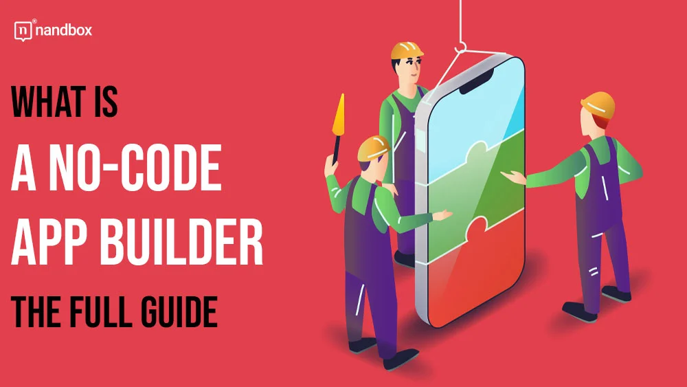
Build a Native App in Minutes Using Visual Builders
Organizing a digital photo album might make you realize you could design an app if you just knew how to code. You no longer need to learn complex programming languages. Today, no-code app builders act like digital building blocks. By treating app features like the pictures you rearrange daily, creating software becomes incredibly simple.
There is a major difference in how these finished tools perform, however. Many platforms create “web apps,” which are essentially websites disguised as phone apps, causing them to run slowly and awkwardly. For true speed, you want no-code native app builder such as nandbox. A “native” application speaks your phone’s exact language, which means it loads instantly and feels completely natural in your hand.
Moving from an everyday user to a software creator is wonderfully intuitive. Instead of typing confusing text, you simply grab pre-made pieces—like an interactive “Chat” window or a “Profile” page—and slide them onto a blank canvas. While professional developers might rely on a highly complex drag and drop react UI builder to organize their specialized workspaces, you get to experience that same effortless movement without the steep learning curve. Just snap the pieces together like toy blocks.
Designing your own custom mobile experience feels empowering because it relies on physical motions your hands already understand. But how does the computer know exactly where you want to place that new module? As you slide items across the screen, the interface actively guides your hand, revealing a secret language of icons that explains why your screen “glows” during a drag.

The Secret Language of Icons: Why Your Screen ‘Glows’ When You Drag
Think about holding a physical puzzle piece; you instinctively sense when it fits into the right spot. Digital platforms recreate this physical intuition by using subtle signals to gently guide your hand. When you arrange elements inside modern ui design tools, the software acts as a silent partner, communicating through shape and color rather than confusing text.
Finding hidden drag zones in familiar apps like Spotify or Gmail is remarkably easy once you recognize this secret language. Creators focus heavily on improving user experience with visual cues, essentially holding your hand through the digital journey. You can spot these interactive areas through four specific hints:
- Icon “lifting”: The image becomes slightly see-through, mimicking physical pickup.
- Cursor change: Your standard arrow transforms into a tiny grabbing hand icon.
- Target highlighting: The destination folder or zone glows softly to welcome the drop.
- Sensory feedback: A subtle “snap” sound or phone vibration confirms a successful move.
Mastering these visual triggers makes daily tasks faster, and applying them guarantees your own software projects feel professionally polished. Following these best practices for accessible interface design ensures everyone can navigate your screens smoothly, regardless of their tech skills. While these glowing targets work beautifully on a computer monitor, adapting that magic for your smartphone requires mastering the mobile slide.
Mastering the Mobile Slide: Making Small Screens Feel Huge
Using a computer mouse provides precise pointing, but your finger naturally covers up a phone screen. Great apps work quietly behind the scenes, ensuring touch and mouse compatibility so the experience feels seamless anywhere. Often, solving common mobile navigation challenges simply requires understanding the “long-press.” Instead of clicking a button, you gently rest your fingertip on an item until it reacts.
That tiny vibration you feel is haptic feedback—the phone’s physical way of whispering, “I’ve grabbed it.” Recognizing this subtle buzz makes applying the principles of modern dashboard layouts to your smartphone completely natural. To master mobile dragging, remember these steps:
- Wait for the “pop” sensation before moving.
- Maintain steady pressure as you slide.
- Wait for the folder to expand before dropping.
Sliding your finger smoothly lets you navigate complex mobile dashboards with ease, transforming a cramped display into a highly organized workspace. Now that you understand how these physical gestures blend with screen visuals, you are no longer just tapping glass; you are smoothly directing your digital life.
Your Action Plan: Choosing the Right Builder for Your Digital Project
You already possess the intuition needed to master modern technology. By understanding how drag-and-drop software mirrors the physical world, organizing your daily digital life—or even creating your own apps—no longer requires a computer science degree. You now know how to turn tedious, multi-step menus into a single, effortless movement.
Ready to put this into practice? Implement a 3-step audit of your current digital workflow to find drag-and-drop opportunities:
- Identify a repetitive task where you currently click through multiple screens.
- Choose a builder matching your goals, like nandbox, which is highly rated among no-code development platforms for beginners.
- Start your first no-code project with confidence by experimenting with just one ‘drag’ interaction to see immediate results.
Try it right now: open your smartphone home screen, grab an app icon, and slide it into a new folder. Notice how the screen actively highlights the folder to welcome your movement? Each time you look for these visual cues, you will build confidence in your technical skills. You are no longer just clicking isolated buttons; you are physically shaping your digital world.
Frequently Asked Questions
What does it mean that drag-and-drop is “direct manipulation,” and how does it work?
Direct manipulation lets you act on digital objects as if they were physical ones. In drag-and-drop, you follow a three-step flow: Grab (click/press to pick up the item so it “lifts” from the screen), Journey (move it while the interface gives feedback like highlights or color changes over valid targets), and Release (let go to drop it into place). This mirrors real-world motion, reduces steps compared to menus and buttons, and makes actions feel immediate and intuitive.
Which visual cues tell me where I can drop something, and how do they prevent mistakes?
Interfaces use a “secret language” of signals to guide you: the item appears semi-transparent to show it’s lifted, your cursor may change to a grab hand, potential targets glow or highlight to welcome a drop, and subtle haptics or sounds confirm success. When an area doesn’t highlight, it’s a built-in safeguard—like refusing to drop a text file into a music playlist—so you avoid mismatched actions without confusing error messages.
Why is visual organization faster than navigating lists and menus?
Visual layouts tap your spatial memory—you remember where things are, like knowing which kitchen drawer holds silverware, without reading labels. Dragging items into grids, folders, or calendars reduces mental effort versus scanning long lists or drilling through menus. Studies cited in the piece note that replacing multi-step buttons with physical movement can cut friction in data-entry workflows by up to 40%, speeding up common tasks like sorting photos, triaging email, or moving calendar events.
How do I use drag-and-drop effectively on mobile, and where should I start in my own workflow?
On mobile, use a long-press until you feel a haptic “pop,” keep steady pressure as you slide, and wait for folders or zones to expand or highlight before releasing. To apply this today, run a quick 3-step audit: identify a repetitive, multi-screen task; pick a fitting builder (e.g., nandbox for native apps); then prototype one drag interaction to see immediate gains. A simple first step is reorganizing your home screen—drag an app into a new folder and watch for the highlight that confirms a valid drop.