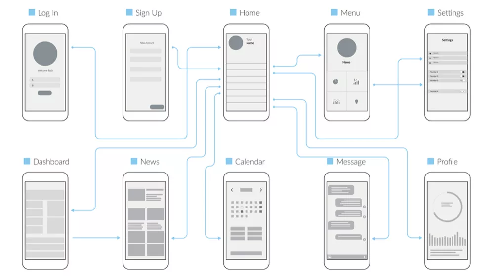
Mobile App Wireframe Template: How To Create And How To Accelerate
Before you dive into designing your mobile app wireframe template, you need to take some time to think about the overall structure of your app and how users will navigate through it. This is where wireframing comes in.
A wireframe is a process of creating simple skeletal outlines of your app’s screens and the connections between them.
It’s the first step in your design process, and it’s a must if you want to make sure your app is easy to use and does everything it needs to do.
Why is it Important to Create a Mobile App Wireframe?
Because they help you map out the skeleton of your app or website and establish the basic layout, hierarchy, and relationships between different screens and content blocks. But before anything, let’s talk about the user flow.
User flow means the steps that your user takes to achieve a certain goal.
The user goal is one of the most important parts of the user flow and the whole process of creating a mobile app wireframe template.
A user might try more than one way to reach a certain goal. This means that the user flow might not be straight.
User flows will help you figure out what wireframes you need to make and how they should be linked. Simple shapes like boxes and arrows can be used to show how things move. You can create user flows on paper or with a digital tool.
The 5 Steps to Create Your Mobile App Wireframe Template
Mapping
Mapping/sketching the user journey in your app, from the signup tab to the logout button, is a great way to quickly come up with ideas. It’s easy to do and doesn’t require much effort. You don’t need any special equipment to start sketching. Just grab some paper and pencils and have at it.
You may search for what is trending in the mobile app wireframe template design and then choose the main layout that you will use.
- Mobile App Wireframe Template
Identifying the Overall Layout
After ending the sketching phase, now you should set your sketch into a specific mobile frame to see how your layout will look and improve it as you want.
There are also a lot of user interface kits that can help speed up this process and make low-fidelity designs look a little better. For example, a 414×736 px artboard, which is a medium-sized artboard that will fit most phone screens.
You can create this with any design tool that has preset sizes built in, such as Adobe XD.
Testing Content Scales
After you made a prototype of your app’s layout, now is the time to test what your content may look like in your app, and if it needs any improvements, make them.
Adding content to wireframes helps you understand how the page should look when it’s finished. You can use images, text boxes, tables, etc. to create a visual representation of the page. This way, you will be able to see if there are any issues with the structure of the page.
Closing the Prototype Design
Here, you’ll get close to finishing your mobile app wireframe template by listing some functional moves in your app wireframe:
- What are your prioritized pages/screens for each section in the app?
- How will you navigate your user in the total user experience?
- Prototype Design
Improve Your Flow and Layouts
You may stay in this phase for some time to identify any spots that need to be improved to reach the best layouts and user flows you want.
After this, you might move on to the next stage, the development phase.
Final note:
Building your app through nandbox app builder will make the whole process of creating a mobile app wireframe template, so easy. It’s just a matter of seconds and you are ready to move forward to the following stages of building your app and your business. With nandbox, there is no need to worry about any technical hassle.


