If you’ve been researching how to design your travel website recently, you’ve likely encountered the term “mobile-first.” But what does it really mean? It’s not just about shrinking your desktop site to fit on a smaller screen—it’s an entirely new design philosophy and process. Mobile-first flips traditional design thinking on its head, and it might be the key to connecting with today’s on-the-go travelers.
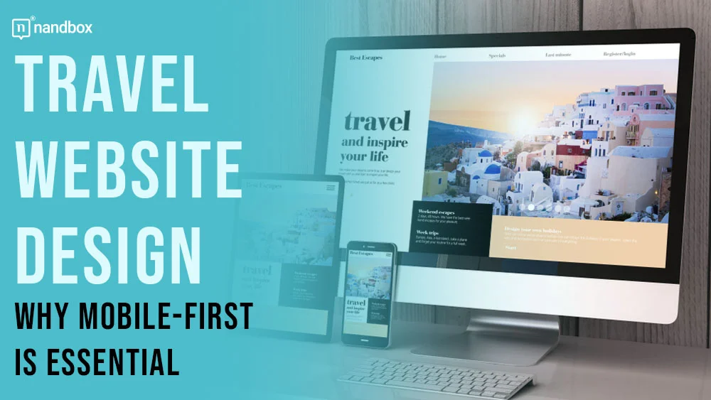
What Is a Mobile-First Design in Travel?
Mobile-first design in travel is the process of planning and developing digital products for mobile use first before designing for other devices. This applies to travel portals, booking engines, and other travel-specific tools. It ensures products are fully compatible with mobile and native to that platform.
How It Works
Here’s how it works: You build for mobile, keeping in mind all the specifics of this platform. You focus on essential features that work well, specifically on smartphones. Only then do you expand to larger screens, like desktops or tablets, if suitable. You can add more features that are expected to be included on those platforms specifically.
Why would you do this? For a long time, designing computer screens was the main priority in travel. Mobile was just an afterthought. This approach is called, you guessed it, a desktop-first design. More people used their big screens for booking and travel, and starting the design process for mobile was considered almost wild. But everything changed — with 67.8% of all traffic in the travel industry now coming from mobile devices, it’s no surprise that you should consider building for mobile first.
Travel Website Design: Mobile-First Design vs. Responsive Design
Before mobile-first design became popular, there was (and still is) another omnipresent trend: responsive design. They might sound and look similar: both work relatively well on mobile devices and share the goal of optimizing user experience. But the devil is always in the details: they share core principles, but they’re different in overall philosophy, approach, and execution.
Responsive design is a fluid design built to adapt easily to different screen sizes, whether on mobile or desktops. At its heart are flexible grids, flexible layouts, and CSS media queries. These adjust automatically and change the design based on the device’s screen width. Usually, this means you build for the biggest screen possible, like a desktop, and scale it down to smaller screens. It’s great for designers because the website will adapt to fit any device screen.
While responsive websites can do all that and more, they don’t really focus on the mobile user experience. In fact, they often ignore it completely, thinking it will perform okay as it is. But surprise: responsive web pages might not perform well in a mobile environment. They can scale down differently on various devices. The antidote to this is mobile-first design: which ensures that mobile UX is always at the forefront.
Here are some other key differences:
Travel Website Design: Content Priority
Mobile-first is all about being economical. You need to prioritize content due to limited space and mobile constraints. With responsive design, your hands are untied, and many designers don’t think about it at all. This can lead to serious content overload on mobile devices.
Performance
Mobile-first design, being more optimized and less cluttered, results in faster load times on mobile devices. It works great most of the time, even on bandwidth-limited mobile connections. Responsive design is often worse in this aspect. It starts with a lean base and adds complexity for larger screens.
Design Philosophy
Mobile-first focuses on simplicity and essential features. You can’t really cram complex desktop experiences onto tiny displays. Responsive design is a bit different — it aims for consistency across all devices, so it has to be all things to all screens.
It’s important to understand that mobile-first and responsive design aren’t canceling each other out. In fact, a well-executed mobile-first design is responsive at its core. It starts with a mobile-optimized layout but can still adapt seamlessly to larger screens. This way, you prioritize the mobile experience without sacrificing flexibility across devices.
It’s up to you which design approach you should focus on. However, it’s a much more logical choice to consider a mobile-first approach. Mobile is here to stay. This is where your travelers are, and its popularity will only grow. Meanwhile, desktop use will diminish in importance in the future, and this future is just around the corner.
Travel Website Design: Principles of Effective Mobile-First Design
Keep it simple
Minimalist design is the cornerstone of the mobile-first approach. Sure, every designer loves to be creative and wants to show off their skills but remember, simplicity is key. Avoid overwhelming users with unnecessary elements. Include only the most important content and features. Use white space to your advantage in creating a clean and uncluttered layout. Your users and conversion rates will thank you for it.
Guide the eye
Visual hierarchy is all about ranking design elements in order of importance. When you use it effectively in your mobile-first design, you can guide users’ attention and lead them to take desired actions.
There are several visual hierarchy principles you can apply. Consider size and scale: enlarge important elements so users easily notice them. Play with colors and contrast: use bright hues or high contrast to make key elements stand out. Change perspective to create depth or separation: try blurring the background, adding drop shadows, or using parallax effects. Whatever techniques you choose, keep it uncluttered and balanced.
Make it scannable
Most users don’t actually read every word on a page. They scan briefly, with only a small portion paying close attention to all the content. (If you’re reading this sentence, congratulations — you’re in that attentive portion of users.)
Since users prefer scanning, design your content accordingly. Use plenty of headings and subheadings. Incorporate bullet points to present information concisely. Keep paragraphs short so they fit on mobile screens without scrolling. And don’t forget to use white space liberally. Making your content scannable helps users quickly identify important points without getting lost, boosting engagement while staying true to mobile-first principles.
Focus on CTAs
Your CTA should be front and center, with a clear copy. Users need to easily find your CTA, understand where to tap and know what’ll happen when they do. Keep it consistent and value-driven throughout your design.
When crafting CTA buttons, opt for vibrant colors that catch the eye, but ensure they align with your overall style. Beware of overly bright or flashy CTAs; they might come off as spammy or untrustworthy. Don’t rely solely on your own judgment; invest time in testing your CTAs and button placement. Use methods like first-click testing to refine your approach. This way, you’ll create CTAs that not only look good but also effectively guide users to take action, enhancing your mobile-first design’s performance.
Travel Website Design: Why Mobile-First Design is Important for Travel Websites?
Tap Into a Large User Base
As we mentioned before, most travelers are glued to their phones, and they do it for a reason. It’s simpler to research destinations, book flights, and reserve hotels on those small screens — mostly because users do it while traveling or at the last possible moment before traveling. By adopting this mobile-first approach, you can tap into this vast user base. You’re not just adapting to user habits; you’re actively supporting and encouraging them.
You are essentially expanding your user base and ensuring that device restrictions don’t interfere with their travel planning and booking processes. As a result, your potential customers will come and stay with you and won’t look to competitors who also offer a simple mobile experience.
Boost Search Engine Rankings

Search engines like Google prioritize mobile-friendly websites in their search results; this is called mobile-first indexing. For travel websites, this means that a mobile-first design can significantly improve their visibility online. By optimizing for mobile users, travel companies can climb higher in search rankings and reach more potential customers organically.
Upgrade your UX

The mobile-first design pushes developers to focus on the most important content and features. This results in a streamlined and easy-to-use website. This approach can lead to faster loading times, simpler navigation, and more efficient booking processes. By prioritizing essential features and cutting out unnecessary clutter, the mobile-first design creates a better experience for travelers.
Conclusion
This isn’t a trend issue; it’s a relevance issue. The answer is not whether you must go mobile-first, but how quickly you can move to this increasing market. By focusing on mobile from the start, you create streamlined, faster-loading sites that perform well across all platforms. While the desktop isn’t obsolete, it’s no longer the default standard, and you should keep that in mind.