In truth, there are many messaging apps on the market. Each popular one has something valuable that sets it apart from the competition. In the world of chat apps, there’s always demand, as chatting is now the standard communication method. This article isn’t about your ordinary chat app, though. Even seniors have reluctantly adapted to using texting to communicate. However, they may face some difficulties with some apps. So we created this article to show how you can build a messaging app for seniors.
Why Create a Messaging App Specifically for Seniors
Technology’s constant evolution has repeatedly reshaped how we communicate, and seniors have had to keep up. The latest update involves using chat apps to catch up with their children and friends. It’s not easy for a person to learn a new technology, let alone someone older. They face many difficulties with features and design that make it a burden for them to perform functions we deem basic. So, creating an app with them in mind would tremendously facilitate texting and calls for them.
Additionally, they often get bored and lonely after retirement, so the app would give them something to spend time on. Not only can they contact family, but they can also make new friends to chat with and share their stories and life lessons with.
How is a Seniors App Different to Develop from any Other Messaging App
- The first difference is the design. Most designers are naturally young— app development is a relatively new field— and they can’t imagine the limitations that older people have.
- The UI design has to be simple, with minimal elements, because a crowded design might get irritating and confusing. For example, the text has to be sizeable for them to read it clearly.
- Color vision decreases with age, making it hard to distinguish some colors, like blue. So when designing an app for elders, avoid making the texting color in blue or any color that might confuse them. Another design option to help with low color vision is creating color contrast between the background and the text. Try not to use colors as indicators because it might cause frustration if the users can’t tell what the functions are.
- Other elements that could help with accessibility are adding subtitles to videos and audio for the hard of hearing.
- A seniors messaging app should only have the core features without additional elements, as too many may cause frustration.
- Consider adding a tutorial video to the app to help them understand how it works. Or you can add a visual onboarding screen with clear instructions. Make the onboarding screen easy to access again if they forget how to use a function.
- Make the icons big with space between them because older people often have hand-eye coordination declining with age.
- Try to minimize the scrolling and click actions to avoid any displacement.
- The only general rule is to keep it all simple. Fewer features, fewer UI elements, and less complex functions.
Must-Have Features in Seniors Messaging App
Chat and Group Chats
An essential part of any messenger, users should be able to chat in groups or one-on-one and share media. Who doesn’t want to share cute pictures of their pets and grandchildren with their friends? An extra effective feature is to remind them to turn on WiFi or mobile data when they start chatting. Sometimes, they forget they need a connection for the app to work. Additionally, incorporating an AI headshot generator for individuals can personalize user-profiles and enhance the chatting experience.
Voice Messages
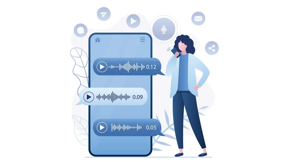
Texting can get tedious for anyone whose fingers aren’t used to it. A voice message feature and tutorial on using it would come in handy. Sometimes, it would be hard for the user to hold the voice message button, so it would be extra helpful if they could do something less demanding. For instance, they could double-click the icon. A sound or any indicator that the phone has started recording the message would save them from a recording by mistake or the opposite.
Audio and Video Call
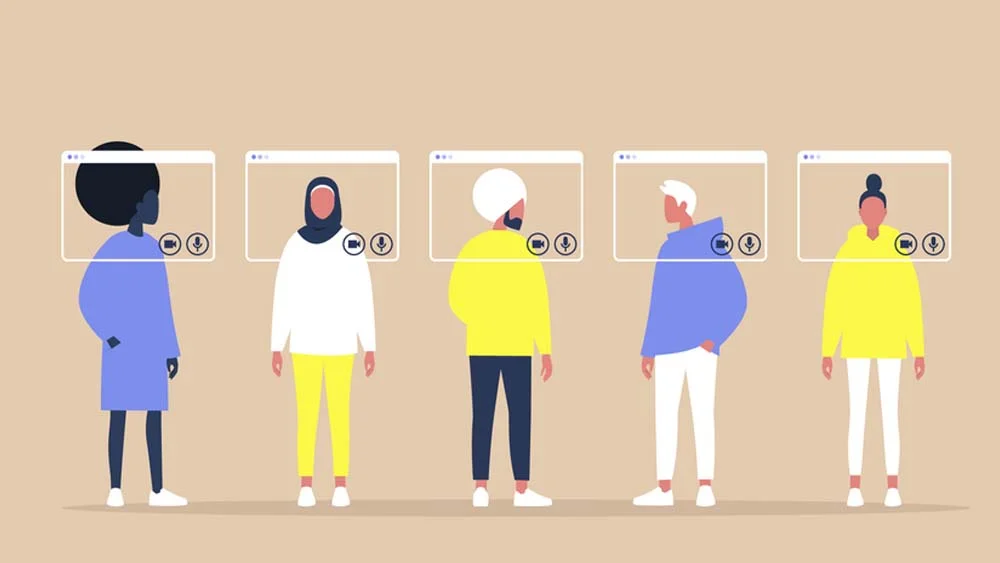
Older children sometimes get too busy to visit their parents; that is the way of life. Or else they live across the world and aren’t able to go back home. In any case, audio and video calling is free and efficient in keeping the family intact. Finding the audio and video calling tabs should be straightforward for the users, and they should be able to tell both functions apart. The call button should be bulky to avoid clicking by mistake to call or hanging up.
Contact List
A contact list is indispensable; it could be made specifically for the app or one that syncs with the phone’s contact list. The names on the list would be sizeable enough for anyone to read them without mistaking one for another. A contact categorization would help them find the contact easier but be careful not to include too many actions, causing confusion.
Map Tracker
Caretakers often worry about older people being absent from home. They don’t know if they are lost with all the landmarks changing or if they’re taking a walk nearby. That’s why a map tracker would help everyone rest assured. Another helpful location-based feature is a GPS navigator, made specifically for older people. It would take slower and repeat instructions if asked. So, if they are lost, they can find their way home.
News Feed
A custom-tailored newsfeed is perfect for helping older people stay updated with important world news. It would differ from a typical newsfeed because the text would be sizeable and easier to understand. The content would be wholesome, as opposed to war and crime news. Additionally, the pictures added would be in high resolution and with vivid colors that have some contrast to avoid color confusion.
Final Thoughts!
All these features are available for nandbox app builder users to help you create an app made specifically for older people. On top of that, nandbox even offers pre-made messaging app templates that you can use to create a messaging app in just minutes. Show them that you care, and sign up now for free!
How to Create a Messaging App Using ChatGPT without Coding On a Budget
Ever wondered how to create a messaging app using ChatGPT? With nandbox App Builder GPT, you can build both iOS and Android native chat apps using ChatGPT without coding. Just describe what you want in ChatGPT, and once you finish the conversation, the GPT instantly gives you a direct link to nandbox, where your app is already generated and ready to be customized or published. nandbox allows you to create fully functional native apps on a budget. Our Basic Plan is the best pricing plan to explore features, customize, and create an app with all the essential features.


