Web ad banners are one of the oldest forms of online promotion, dating back to 1994. It started with a simple rectangular image featuring colorful text: “Have you ever clicked your mouse right here?” This resulted in an impressive 44% conversion rate. Given that users have now developed banner blindness, modern marketers would be astounded by such numbers.
Fortunately, design can have an impact on such advertising’s conversion rate, despite the fact that it has significantly decreased since the first banner appeared. All you need is to purchase high-resolution images, which can be found on stock content marketplaces like Depositphotos, and set the targeted approach. Read on to learn more!
What is an advertisement banner?
In digital marketing, web ad banners are graphical elements placed on third-party web sources to attract attention to a company or drive traffic to a website. It’s similar to traditional billboards strategically located in cities and along highways.
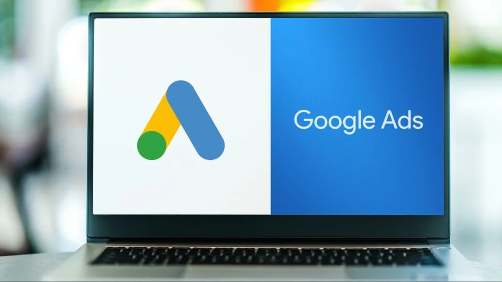
Launching banner ads doesn’t require individual negotiations with various websites. That’s where ad networks come in handy. The simplest example is Google Ads, where you need to create and set up your advertisement while its algorithms decide on placement. For optimal results, partnering with a Google ads agency can help navigate and maximize the platform’s capabilities, ensuring your ads reach the right audience effectively.
Banner ads include several mandatory elements to consider during design:
- Unique selling proposition. This can be a catchy slogan or straightforward headline explaining the essence of your offer.
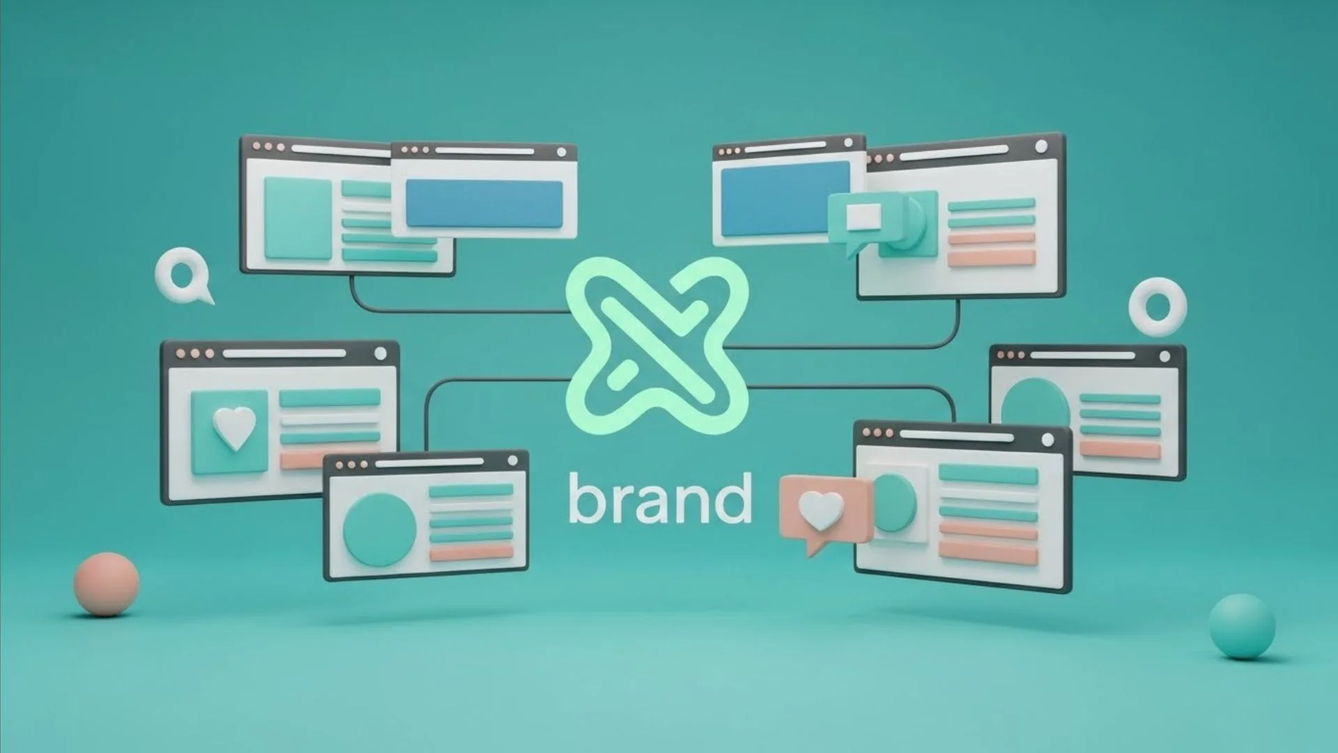
- Graphic elements. Typically, these are pictures. Designers or their clients can buy images online for banner advertisement. Nonetheless, you must ensure your graphics are visually appealing, relevant, and high-quality. Furthermore, a company’s color palette and unique patterns can enhance brand recognition.
- Call-to-action (CTA) button. This should explain to the user what they’re required to do. For example, you could visit a website, get a discount, or sign in, all depending on your particular goals.
FAQs:
How can you create a banner for advertising?
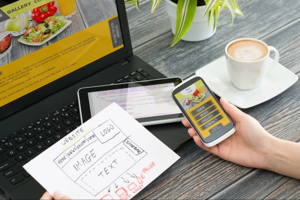
You can design web ad banners using graphic editing software, like Photoshop for desktop, or online solutions such as VistaCreate, Figma, Sketch, or Uncrop for expanding images at no cost. Before diving into a project, ensure that you have all the essential details from your client: size, objectives, target audience, placement, and required visual elements.
How to create well-performing advertisement banners
Simply understanding a banner’s essential elements isn’t enough to create compelling marketing materials. This is because advertising follows users everywhere, so they become accustomed to seeing various types of banners across different platforms and contexts. To stand out and capture attention, you’ll need to understand consumer behavior, analyze heatmaps, and employ unique strategies like avoiding overly aggressive sales pitches. Here are some helpful design tips on boosting your banner ads.
What makes good web ad banners?
A good advertisement banner should grab attention, which can be achieved in various ways. For example, through using contrasting colors or experimenting with fonts. Moreover, a user should clearly understand what action to take, such as clicking a link or obtaining special offers.
Understand how users scan your banner
In user interface programming, there are two common information processing strategies—Z and F patterns. Essentially, they describe how people typically scan images or text with their eyes. The F pattern is often seen when users engage with larger pieces of information, like blog articles or landing pages. On the contrary, the Z pattern applies to simpler content. Of course, user experience may vary, so you can conduct A/B testing with different strategies and access the click-through rate after launching a campaign.
Consider banner size
Advertising platforms often disclose their requirement for banner sizes. The common ones include 728×90, 300×250, 336×280, 160×600, 300×600, and 320×50 pixels. However, it’s often found that larger banners tend to perform better due to their ample space for text and visuals. This is why 57% of marketers prefer the 728×90 dimension.
Generally, before creating a design, it’s important to brief the client on the required sizes and platform specifications. After all, circumstances can vary.
Utilize negative space
Since other design elements frequently surround advertising banners, they may appear cluttered and difficult to notice. Therefore, incorporating some white space can be beneficial. For example, keeping the borders of your banner free from excessive details can help it stand out on the page.
Tell a micro-story
Visual storytelling is a technique that helps sell without being pushy and is highly engaging for users. For example, you can include testimonials from a real person describing how your products or services have made their life easier. Or, utilize visual metaphors to convey values through associative imagery.
Employ unexpected visual elements
To apply this tip, you should let your imagination run wild and grasp the context of your project. Yet, feel free to play around with unique color schemes, integrate optical illusions, or even craft a banner puzzle. This can certainly grab a user’s attention.
Play with scale and depth
Visual contrast manipulation is a great design technique that catches the eye. There are many ways to do this in banners. For example, you can add a 3D effect to your graphics by playing with light and shadow. Or, portray objects differently from how they appear in reality. For instance, shrinking a car or house while enlarging a tree.
Integrate animations
Dynamic content is another compelling way to grab user attention. It doesn’t have to be complex animations; you can simply use hover effects or ready-made templates in graphics editors, like ticking clocks.
Ensure mobile responsiveness
According to Oberlo, there are around 4.88 billion smartphone users worldwide, with a yearly growth rate of 2.2%. This indicates that more than half of people browse content on sites from small screens, where tiny images may not be easily visible. As a designer, you should prioritize responsiveness, which means adapting your banners for mobile devices. This involves using high-quality graphics that won’t pixelate.
What are some tips for designing a successful banner ad?
Firstly, keep your banner simple. Avoid adding too many visual elements just to make the image brighter. Instead, focus on conveying the main message through the headline and CTA. Secondly, use high resolution graphics. Since ads are often displayed on mobile devices, low-quality images become blurry on small screens. Also, pay attention to file size; if it’s too large, the banner will take a long time to load.
3 great advertisement banner examples
Let’s explore real-life examples of how banner advertising can still be effective when designed strategically.
CBS
CBS is an online television service that broadcasts a variety of content. Rather than just promoting the company’s benefits, the brand offered users something they genuinely enjoyed. CBS featured visuals from the popular series “Blue Bloods” in their ad banner, with a call-to-action (CTA) button offering free access to the broadcast for one week. This collaboration between marketers and designers is a commendable example of effective advertising.
SEMrush
SEMrush is a renowned platform that provides tools for SEO specialists. When developing their banner for advertising, the company’s designers and marketers prioritized simplicity, contrast, and clear explanations.
The New Yorker
The New Yorker is another example of how seamless design can effectively communicate a unique selling proposition. The magazine initiated a promotion aimed at new subscribers, offering users a free tote bag upon registration. The essence of the offer was conveyed through color, CTA, and fitting visual elements.
Conclusion
While banner advertising has seen a decline in effectiveness since its introduction, companies still invest in it. The crucial factor is how it’s executed. Colors, visual elements, and spatial arrangement can grab user’s attention. Therefore, to increase your click-through rate, focus on the right design tactics.