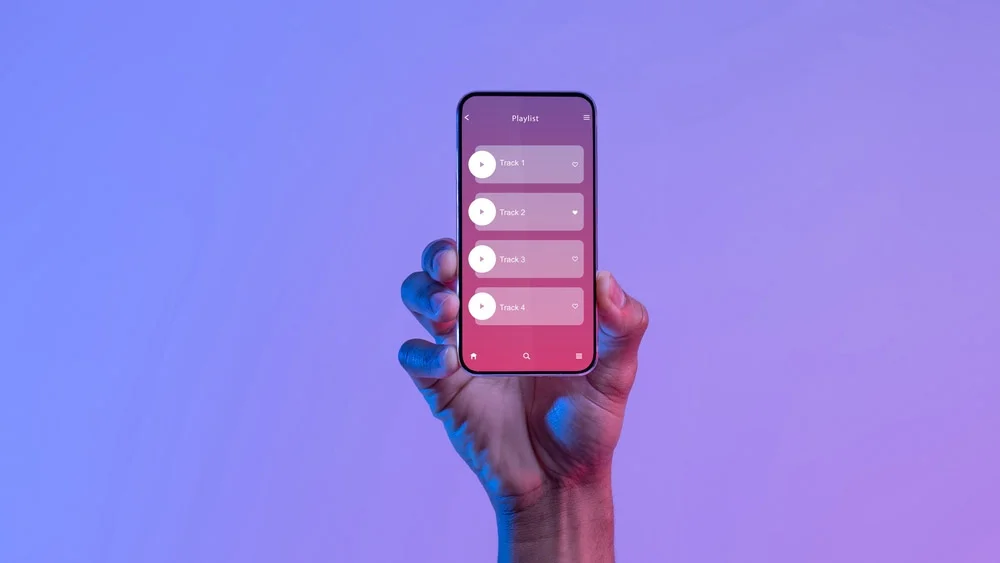
A user interface is where people and computers connect and communicate. User interface design is about deciding how these connections should look and work. Think about using a website to book flights. The screens you move through, the buttons you press, and the information you enter are all part of the user interface. A big part of UI design is making sure that the elements on your website are easy for your audience to use. You want them to be able to move around and use your site without any trouble. It’s also important to include elements that are easy for your audience to understand. UI design focuses on how your audience interacts with your website. This is where you make your site simple so that your audience can find what they need and move around easily.
If you want to build a website with great UI design, use Hocoos. This AI website builder helps you to create sites with user-friendly design and functionality. You just need to answer 8 questions, and the tool will build a website for you in just 5 minutes. Once your site is ready, you can edit the elements to adjust the design as per your requirements. You can do all this and more for FREE!
10 Best Website UI Design Tips
Now that you know more about UI design and how it improves your site, you’ll want to include it in your website’s design. Here are the 10 UI design tips to make your website better for your visitors.
1. Know Your Target Audience
The first step is to really know who uses your website. This means more than just looking at numbers in your analytics. It means knowing what your users need and what might be stopping them from getting what they want. To do this, you need to talk to your users directly. Watch them use your website and ask them questions to find out what they’re trying to achieve. What are their goals? What challenges do they face? How can your website help them?
It’s not just about knowing what users want but also what they really need. By addressing their core needs, you’ll also meet their wants. The insights you gather from talking to users and analyzing data will guide everything you do on your website, from how it’s designed to what content you feature.
2. Understand How People Will Use Your Interface
This is especially important now, with touch-based devices becoming more common. For example, Instagram’s experience relies heavily on a simple scroll and double tap.
People interact with websites and apps directly by using the elements on the screen, like tapping a button or swiping a card. They also interact indirectly, like using a mouse to click or typing into a form field. Your users and the devices they use should influence your decisions. For instance, if you’re making a website for kids, use big buttons and simple actions like tapping instead of complicated stuff like dragging. But if you’re making a fancy photo editing tool for professionals, make sure it has lots of advanced options and precise controls for using a mouse or stylus.
3. Choose Your Page Layout Wisely
This is one of the most important UI design tips. The way your page looks is really important for how people use your site. It should be simple and easy to understand but also match what your audience wants. Think about what’s most important on your site. For instance, if you run a bakery, you’d want to highlight your freshly baked goods. So, you might feature a mouthwatering image of your best-selling cakes or pastries at the top of your website’s homepage. This is called visual hierarchy. It helps guide people’s eyes to the most important things on your page. With a good layout, everything looks neat, and it’s easy for people to read.
4. Consider the Placement and Size of Elements
Did you know? The time it takes to click on something depends on how far away and how big it is. So, the closer and bigger something is, the easier it is to click. This information is very useful when designing your website’s UI. Here are some UI design tips to keep in mind regarding the size and placement of different elements. Make buttons and other clickable things big enough to see and tap easily. This is especially true for things like menus and links. If they’re too small, people might click the wrong thing by mistake. Make the buttons for the most common actions bigger and easier to find.
Put important things like menus and search bars where they’re easy to reach, like at the edges or corners of the screen. This makes it easier for people to click on them without having to be super accurate. And always think about how people will interact with your site. If it scrolls sideways instead of up and down, make sure users know how to do that.
5. Keep Forms Short and Simple
Lots of websites use forms to gather information and attract customers. But if forms are too long, they can annoy people. People don’t like spending a long time filling out forms, especially when they’re busy. So, when you design your website, think about whether you really need all the forms you have. Only use forms where they’re really important for getting valuable information. When you use forms, make them easy. A short form is more likely to get filled out. Just ask for the most important information so users can finish quickly.
6. Anticipate Mistakes
When you design your website, think about human error. People make mistakes, like forgetting to fill out parts of a form. This can be frustrating, like when you fill out a form but can’t click “Next” because you missed something. To avoid this, add features that expect mistakes. For example, buttons can stay inactive until you fill out everything in a form. If the button doesn’t work, users know they missed something. You can also include things like checks for proper email formats, pop-ups to confirm actions, or alerts for mismatched passwords. These help users have a better time on your site.
When you plan for mistakes, users have a smoother experience. They’ll stay on your site more, which is good for your business.
7. Make Sure Everything Is Easy to Understand
You want your website to be easy for people to use, right? That means using design elements that are clear and make sense. People should know what each element does without having to think about it too much. If things are confusing, people might avoid using them. Stick to using common elements that people are familiar with, like a shopping cart icon for shopping, a bell for notifications, or a hamburger button for menus. When people recognize these elements, they’ll feel more comfortable using your site.
8. Keep Things Simple and Consistent
When you design your website, remember to keep things simple and consistent. Use the same elements and icons throughout your site, and make sure each page looks similar.
Using common elements, like icons for shopping or notifications, helps your audience feel comfortable and makes tasks easier to complete. Consistency also means keeping the same style across all pages, especially with colors and text. You don’t want one page to look totally different from another.
9. Make Decision-Making Easy
On the web, we’re bombarded with lots of stuff competing for our attention: big ads, pop-ups asking us to subscribe, and videos that interrupt us. It can be overwhelming! Hicks’ Law says that the more options you give someone, the harder it is for them to decide. This affects everything we make, like website layouts, menus, and pricing pages. But the simpler we make things, the easier it is for people to make decisions. This is one of the most important UI design tips for new websites.
10. Pay Attention to the Numbers
While we might want our designs to be judged solely on how cool they look, it’s also important to make sure they actually work. User research and testing can help with this, but the data you get after your site is live is really important, too. So, use analytics tools like Google Analytics to track what people do on your site. Google Analytics gives you info like how long people stay on your site and where they come from.
Conclusion
Having a good UI design for your website is key to keeping visitors interested. You want them to enjoy using your site so they’re more likely to buy from you. This will help you get more sales for your business. Now, go out there and create beautiful websites by using our actionable UI design tips.


